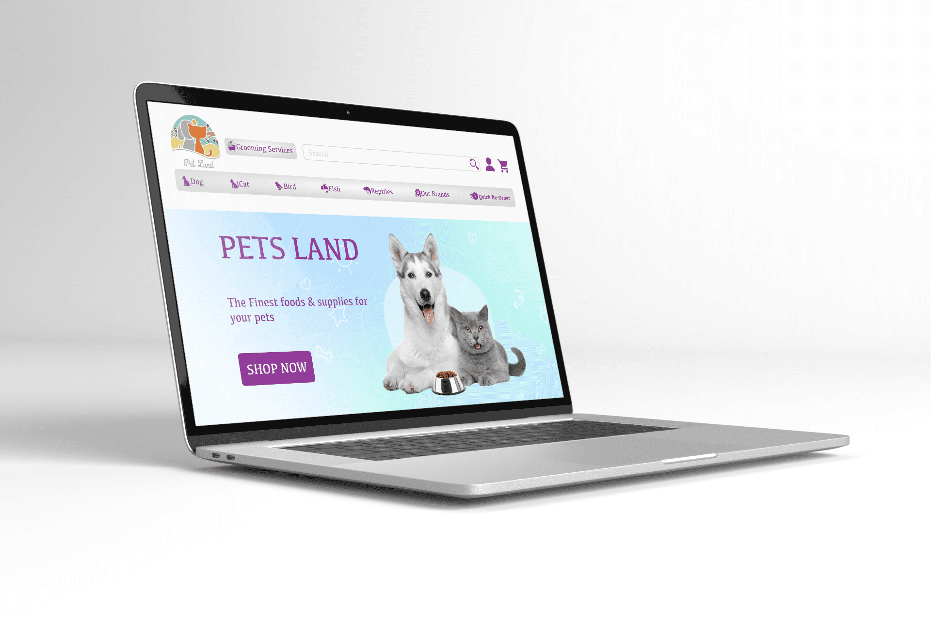
Pet Land
A redesign concept for Pet Land.
My Role
UX Designer (Research, IA, Wirefrafming, Sketching, Prototyping)
Project Type
Solo Project
Client
Pet Land
Duration
2 Weeks
Tools
Figma, FigJam, app.useberry.com
Project Overview
My client was Pets Land which offers an e-commerce website for supply of quality pet products and merchandise. I approached the problem using “Double Diamond” that consists of 4 stages: Discover, Define, Develop, and deliver.
Discover
In order to understand how the company is presenting its brand and business, I started by looking at the current website. Since the objective was to redesign rather than a rebrand.
Competitive Analysis
A competitive analysis was conducted using: Task Analysis, Feature inventory and Element Analysis of direct competitors to see how they are addressing the problem.
Task Analysis
I use task analysis as a process to learn how users actually go about completing tasks to order cat food.
Key findings
No need to have account in all websites except allivet.com.
There are many steps to making the payment process on petarabia.com and allivet.com, while it was less and easier on other sites.
Most sites put the type of pet in the nav bar. When hovering on it, another list opens with the type of product, food, accessories, etc.
Feature inventory
I use the feature inventory to understand the scope of the product and service. It helps me identify which features are most important to users and which ones are not.
Comparative Analysis
I use comparative analysis to gain insight into my competitors’ UX performance. To identify opportunities to better serve users and avoid common usability issues between I herb and Amazon.

Key findings
Amazon more Specific likes and iHerb only show likes without details.
iHerb Has Combo Offers with chosen product.
You can buy directly from Amazon without put the product in the cart.
Define
After gathering all the necessary information from my business research and site audit I moved on to my personas that were given as part of the project brief. I made sure that these personas were referred to throughout the entire product development life cycle to remain focused on the target end-user when making design decisions.
Problems
The Artsy Dad needs to Enough information and feedback So he can achieve product quality assurance.
The Gifter needs suggested products and loyalty rewards so she is encouraged to buy.
Solutions
We believe that by (providing product information and customer ratings by feature) for (The Artsy Dad), we will achieve (product quality assurance).
We will know this to be true when we see (the increase in buying).
We believe that by (recommending product and giving loyalty rewards based on purchasing history) for (The Gifter), we will achieve (loyalty to the store).
We will know this to be true when we see (repeat purchase).
User flows
Artsy Dad User flow to achieve product quality assurance
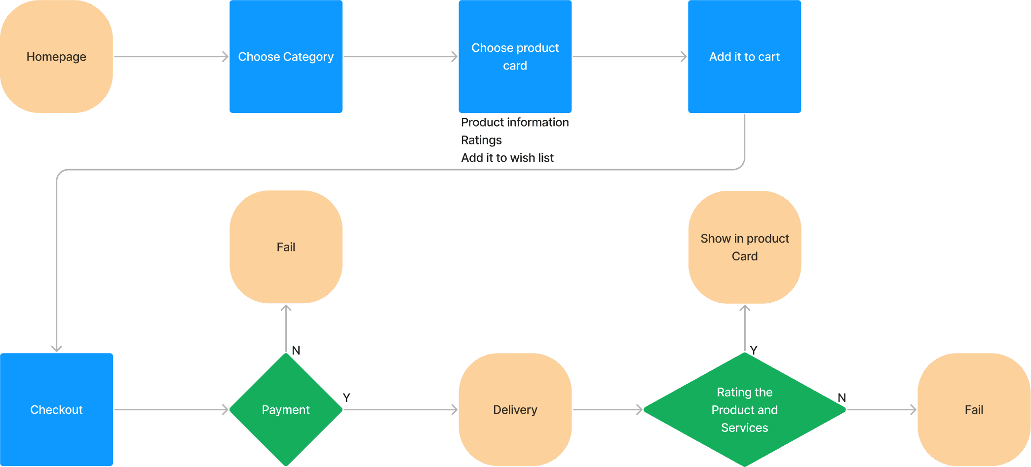
At the end of the process, after delivery, the evaluation takes place and the evaluation appears on the product page.
The Gifter User flow to achieve loyalty to the store

After completing the purchase:
It is added to history.
Points are added to the Account.
Recommended product is created.
Develop
Card Sorting
I use card sorting to discover how people understand and categorize information. I put the products on a app.useberry.com website and asked four of my target audience to catagory them.

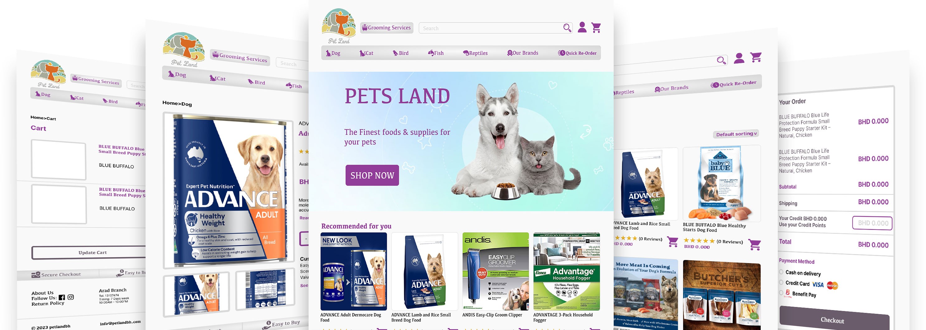
LO FI WireFraming
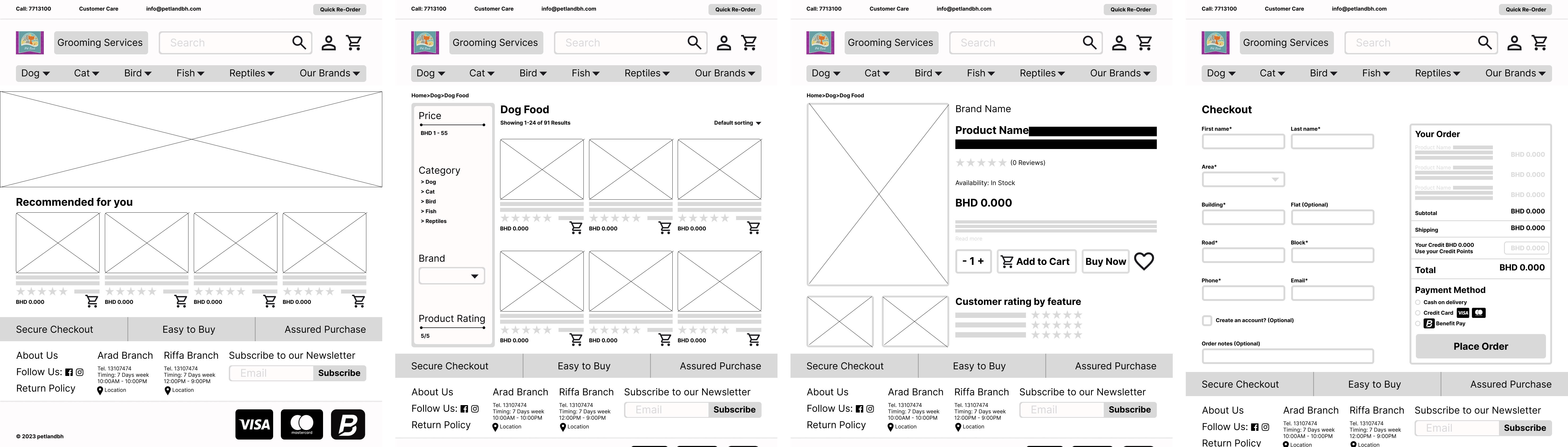
Some screenshots of LO FI WireFraming
Usability Test and Iterations
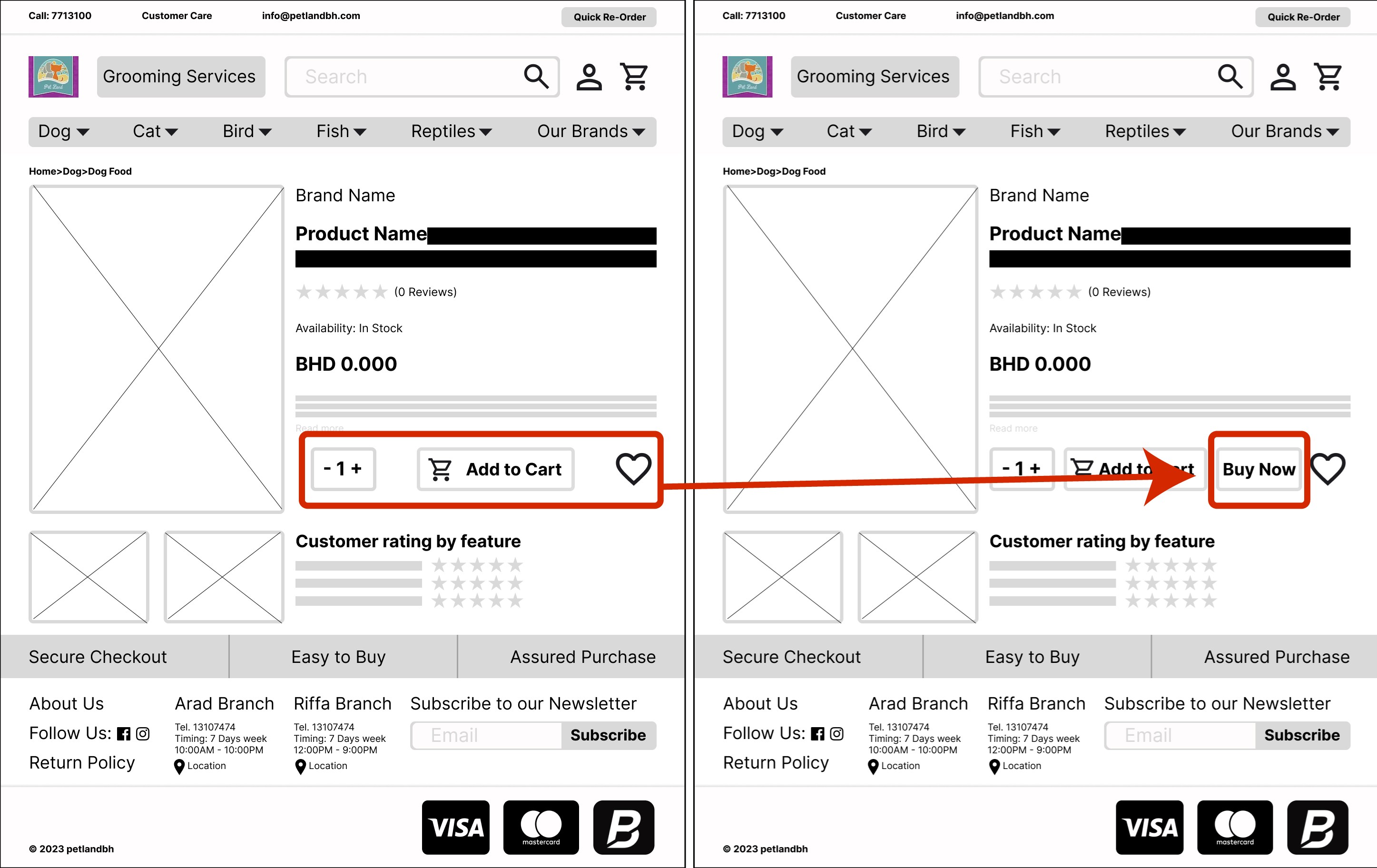
I have conducted 4 usability tests with my target audience, and although they passed the test successfully, through their notes, I made some adjustments to improve the quality.
User notes:
When clicking on recommended product, it was supposed to go to the product card, not to the products.
Add a Buy Now button.
Next Steps
Completing the work on Hi Fi Wireframing and trying to get it to the desired format.
Conducting more interviews and research to try to delve into the problem and try to develop appropriate solutions for it.
More Usability test.
Site built in Framer
Copyright© 2023.